The story starts in 2000, when I curated my first exhibition in the studio of L. Brandon Krall. My curatorial intentions at that time were very naive; I knew only that I finally wanted to organize an exhibition, perhaps the first of many, and that it had to take some specific form. I was not well versed enough in the practice of curating to understand how themes could drive a random assortment of expressions into a singular experience.
The artists I had gathered all had one thing in common: they were female. I didn't care about quotas, I just wanted the best artists I could come up with at the time; and I wanted something more, an amassing of expressions that went beyond the most utilitarian version. I wanted a few things that didn't quite fit, and that in their ambiguity and their mere excessiveness, would push the exhibition's appeal over the top.
I developed a theme for the exhibition that engaged with a variety of female expressiveness but that also evaded the forcible politics of Feminism. I decided to title it 'SUGAR+SPICE' because I wanted to speak to the tangent between the personal and the universal. I wanted to address a regard for identity that is prefigured in our childhood as associated with the nursery rhyme that states “Sugar and spice, and everything nice, that’s what little girls are made of.”

Fire In My Belly (1999) by Amy Chaiklin was perhaps the most forceful image. It showed a woman sitting atop a ladder, suspended in the air by her sexual organ. She has six hands and therefore infers a Hindu goddess, also affiliated with Tantric Yoga, who may be either Shiva or Kali. In Buddhism the belly is supposed to be the residence of the soul, though this may also refer to earthly or spiritual hunger, or the presence of a forthcoming child; the offspring of a deity being the potential manifestation of an elemental force. Whether childbirth or inspiration, hunger or anger, Chaiklin’s depiction of a deity inspired female figure ads a dimension of soulful irreverence.

The Crescent Series (1999) by Carla Gannis was a trio of digital images in which a scene of casual camaraderie served as the background image within a silhouette of a sexual act. Friendship and passion are the two poles of personal identity, one equated with the mores of a communal social contract, the other simultaneously feeding the need for emotional intimacy (communcation, reciprocation, and tenderness) as well as for libidinal intensity. These two drives feed mutually opposed yet equally important needs that are active aspects of character development.
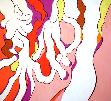
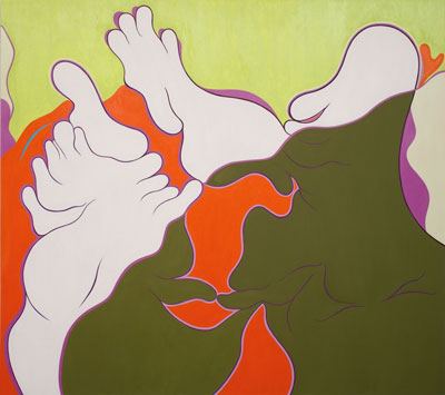
SUGAR+SPICE engaged with the polarities of culturally defined identity, especially perceived roles versus personally assigned ones, and how they merged into one ambiguous system of reference. For it's not really one or the other; it's not really about choices, as I originally thought. It's about learning through stages in one's identity. Whatever we decide we relate to may at one time seem important, and then it will shift as we grow older; it will not become its opposite but a dialectic leading somewhere else entirely.
This exhibition was all about beginnings. Its basic question was: "Where do we go from here?"
Orly Cogan
Jen DeNike
Elissa Levy
Norma Markley
Janet Pihlblad
Raven Schlossberg
Carol Warner
Charmaine Wheatley
Jessie Wolk